Articles in this section
Vtiger Module Designer
Feature Availability
Vtiger Editions: One Professional | One Enterprise | One AI
For Developers: Sign up for the free Developer edition if you want to develop and release extensions to the marketplace.
Introduction
The Module Designer in Vtiger CRM allows administrators and developers to create new modules and extend the functionality of existing modules. It provides tools to customize the CRM interface, build integrations, and add advanced UI behavior using VTAP (Vtiger Technology Application Platform).
Using the Module Designer, you can:
- Create custom modules.
- Extend existing modules with additional functionality.
- Add buttons, widgets, and icons to CRM pages.
- Build custom pages and reusable components.
- Modify the CRM user interface using styles.
- Add scripts that react to user actions.
- Integrate external systems using connectors.
- Components
- Pages
- VTAP Scripts
- VTAP Styles
- Connectors
These resources allow developers to build powerful customizations without modifying the core CRM code.
Modules in Vtiger
A module in Vtiger CRM is where individual record types are segmented, created, and stored. Modules in Vtiger include Contacts, Organizations, Deals, Invoices, and many more. The Module Designer in Vtiger supports different module types and customizer features as listed below:
- Module Types
- Entity Module
- Extension Module
- Embed Module
- Customizer features
- Component
- Page
- TAP Scripts
- TAP Styles
Module Types
- Entity Modules
- Entity modules or core modules follow standard module conventions to store, retrieve, filter, and establish relationships between other entity module records. They support out-of-the-box features like Reports, Workflows, Approvals, etc. Access control to these features, CRM profiles, and data sharing is automatically enabled based on the assigned users of records in the Entity modules.
- Examples: Contacts, Organizations, Deals, Cases, etc.
- Extension Modules
- Extension modules bring functionality without necessarily binding to standard record conventions. They usually provide in-app-specific functionality that works with user-accessible entity module records.
- For example, keyboard shortcuts give you quick ways to perform day-to-day activities using your computer keyboard.
- Other examples: Reports, Dashboard, etc.
- Embed Modules
- Allows you to embed external applications or web pages inside the CRM.
- Examples:
Customizer Features
Module Designer offers an IDE through which you can develop custom code to build your functionality. Through the customizer IDE, you will be able to create and customize the following:
- Component
- Lets you add custom components for specific functionality on a page. It may also comprise one or more UI elements together.
- Example: Menu, One View Widgets
- Naming Convention - Component names follow the core product convention for runtime binding. The format is as follows:
- MODULENAME_Component_COMPNAME
- MODULENAME - Module in which you are defining the component.
- COMPNAME - Name of the component. For example, BasicButton
- For example, if you have a component named CustomButton, its name will be Contacts_Component_CustomButton.
- For more details about the component and its structure, click here.
- MODULENAME_Component_COMPNAME
- Page
- It comprises one or more components that have custom client-side runtime behavior.
- VTAP Scripts
- Enables you to extend the functionality of standard pages or components by subscribing to the event hooks and reacting to the triggers at runtime.
- VTAP Styles
- Enables you to customize the look & feel of client components or pages in the CRM.
- To add custom scripts, pages, and components, you need to use the VTAP Runtime object. This object allows you to interact with the Vtiger user interface and add custom behaviors. Learn more about it here.
Benefits of Using Module Designer
The benefits of using the Module Designer are:- Flexible customization – Extend CRM functionality based on business requirements.
- Reusable components – Create components once and reuse them across modules.
- Improved user experience – Add custom pages, widgets, and UI elements.
- Automation capabilities – Trigger actions when users perform certain activities.
- Integration support – Connect Vtiger with external services such as messaging systems, payment gateways, and telephony tools.
In this article, you will learn about:
- Accessing the Module Designer
- Using the Module Designer to add VTAP Scripts
Using the Module Designer to Add VTAP Scripts
VTAP Scripts are the entry points for custom logic. VTAP Scripts lets you add custom buttons, widgets, etc. You start by giving a name to the script and selecting the module for which the script should run. It is important to choose a module since you very often have module-specific needs, like a button click or a record save. You can create a custom extension module or use existing modules to add a script.
Note: Create an extension module if you want the module to be released via the Vtiger marketplace.

Now, let Us look at a few examples of using VTAP scripts.
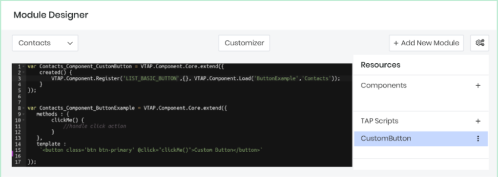
Example 1: Adding a button to the Leads list page.
In this example, we will add a button to the Leads list page. Each script is created with this basic scaffolding, and the name is chosen for the script, as shown below.

The basic building block of VTAP is a component, and it’s based on the Vue component and its life cycle events.
- Name of the component: Leads_Component_Register
- Syntax: {{MODULE}}_Component_{{NAME}}
- Components extend from: VTAP.Component.Core.extend
Functions
- The Created function is the entry point for any component. This is the function where you register buttons or listen for events.

- VTAP.Component.Register API helps you add buttons, widgets, icons, etc. The 1st parameter of the API tells you where you want to add your custom components. To see the list of supported components, click here.
The Template is where you add your HTML, if any. - The Methods are where you add functions that are called in the template HTML. In the example below, we call the ClickMe function when a button is clicked.

Example 2: Adding a widget to Contact’s and Organization’s Summary View
In this example, we add a widget to a Contact’s and Organization’s Summary View. You can use one registration to add the same widget in multiple modules. In such cases, we should add the VTAP Script for all modules. Use the drop-down when creating the VTAP Script.

For the VTAP.Component.Register API, we have a 4th parameter that helps you select the modules to which the widgets should be added. This is how it looks in the Organizations Summary View.

Example 3: Listening to User Actions & Performing Related Actions
VTAP also allows you to listen to user actions, such as when a user creates or updates a record, opens a details page, displays an edit popup window, etc. You need to listen to such events and add a handler to perform actions on them. To see a list of such trigger events, click here.
Below is an example of the event, record saved.
This example will check the Contact's Status when the record is saved. If the Status is Competitor, a notification will be displayed saying, ‘Beware!!'

Likewise, the VTAP platform has provided various UI hooks to insert your custom components, like buttons in the list/detail page, widgets in the Summary View, and icons. For all the different placeholders provided, see the details given in our documentation.
Using the Module Designer to Add Custom Components
Module Designer lets you build custom components and reuse them across different custom pages and other custom components. If you are not aware of what a component is, its importance, and its structure, click here to read about the same. To add a custom component, go to the Module Designer, select any module, and add a Component under resources.

In the example below, we will define a custom component that will show an icon inside the button. We will name it ButtonWithIcon and create it in the Contacts module. You will see the IDE with the default component name.

Example
Let us start writing by the component. First, add the name of the component with ‘ButtonWithIcon’. Since we want to add this in the Contacts module, the final name would be _Contacts_Component ButtonWithIcon.
We want to give a label to the button and pass an icon name to display before the label. These will be provided by the parent component as attributes, so we need to add them to the Props Properties. For icons, we will make use of Font Awesome icons.
props : ["label", "icon"]
Finally, we will add HTML, which will be used to display in the DOM, to the template property. Notice the use of props in templates. If they are used to display as text, then place them under curly braces; if they are passed to an attribute, then activate reactivity by binding with a colon(:).
|
Add_AdvancedSettings_ListPage.js
| var Contacts_Component_AdvancedSettings = VTAP.Component.Core.extend({ created() { VTAP.Component.Register('LIST_ADVANCED_SETTING', {name:'Custom Settings', clickHandler:() => { alert('redirect to settings page'); } }); } }); |
Add_Global_Action.js
| var Contacts_Component_GlobalAction = VTAP.Component.Core.extend({ created() { VTAP.Component.Register('GLOBAL_ACTION', {}, VTAP.Component.Load('CustomGlobalIcon','Contacts')); } }); var Contacts_Component_CustomGlobalIcon = VTAP.Component.Core.extend({ methods : { click(){ alert('click on global action icon'); } }, template:\`< ispan class='btn p-2' @click=click()>< ii class='fa fa-cloud'>< i/i>< i/span>\` }); |
Save and publish the component, and it will be available for any custom page to include. See here how custom components are used in custom pages.
Using the Module Designer to Change the UI
You can use VTAP Styles in the Module Designer to change the look and feel of the CRM, change the color of the buttons, increase/decrease the font size, change the size of default icons, etc. To change these styles in Vtiger, you need to be familiar with CSS. Go to Module Designer and create a new TAP Style, supplying it with a name and an optional module. In the example below, let's build a new theme for Vtiger. Let us call it a BrownTheme and apply it to all the modules.

Add the styles below to change the primary button colors. We use the Bootstrap framework for layout. Save and publish to reflect the changes. Go to the Contacts page and refresh it to see it in action.
|
|

To change the top header, body header, and body content, change the background colors, like below. Save and Publish, and refresh to see the changes.
|
|
Similarly, we have added more changes to reflect the brown theme of different parts of the product. Below, we have added CSS content for the BrownTheme styles. Though this is not 100% ready, it still gives you an idea about how you can build more such themes.
|
|
Final screens would be as follows.
Using the Module Designer to Add Custom Pages
Module Designer gives you the ability to build custom pages from scratch, where you can display forms, lists, charts, widgets, etc., for any existing modules or custom modules.
To create a new page, go to CRM > Platform > Module Designer > Select module > Pages.
Example
We will create a custom page and include the custom component ButtonWithIcon we added in the Custom Component section. In Vtiger, components are the building blocks for any pages, widgets, charts, lists, etc. So when a new page is created, by default page component is added and shown in the IDE.
Let us create a page with the name Custompage and save it. You will see a checkbox with this option - Is admin page? Enable/tick this option if you want to create a page for admin users only. This is generally used when you want admins to configure a feature or store login credentials to connect to any external apps.
|
|
Let us add more buttons with different variants and icons.
|
The final page will look like the image below.
How to access Custom Pages
Any Custom page can be accessed with a URL. URL format is like below:
- $YOUR_INSTANCE_URL/view/$PAGE_NAME?module=$MODULE_NAME
- $PAGE_NAME = Name of the page given while adding the page (all small letters) $MODULE_NAME = Name of the module in which the page is added
- Example: https://acme.od2.vtiger.com/view/Custompage?module=Contacts
- If you are building an admin page, then the URL will change to https://acme.od2.vtiger.com/admin/view/Custompage?module=Contact