Vtiger Sales Insights
Feature Availablity
Vtiger Editions: One Professional | One Enterprise | One AI
Introduction
What better than getting a 360-degree view of your sales team’s productivity and performance at a glance? With Sales Insights, you will have all the updates about your sales team at your fingertips. It gives you reports about your sales team’s activities, performance, and deals in the pipeline, along with comparing their work status and goals.
If you are a sales manager and have users reporting to you, then Sales Insights displays the related data of your reporters. A user’s ‘Reports To’ is available and can be set up in My Preferences.
Use Cases
Let us look at some use cases for sales reps and sales managers.
Sales reps: As a sales rep, you can:
- Generate a report about all the deals in your pipeline and their value.
- Get insights on how your customer-related activities are driving deal closure.
- Gauge your performance against the sales quota defined for you.
- Gain insights into your team's productivity by looking at activity reports.
- Review your team’s pipeline status to align with the forecast and quotas defined for them.
- Monitor your sales team’s performance by looking at idle deals, lost deals, overdue deals, and activity efficiency.
- Get a comparison of your team’s performance against their goal
Benefits
The benefits of using the Sales Insights feature in Vtiger CRM are:
- Improve Pipeline Management: Visually track all your deals, monitor their status, and understand the health of your sales pipeline at a glance.
- Accurate Sales Forecasting: Analyze historical data and your current pipeline to create more reliable and precise sales forecasts.
- Customized Reporting: Use flexible charts and tables to filter data and perform in-depth analysis to get a deeper understanding of your sales operations.
- Boost Team Productivity: Understand which activities (like calls or emails) are most effective, so you can optimize your sales process and coach your team more effectively.
- Get a Complete Performance Overview: Use the dashboard to see how your entire sales team and individual reps are performing against their goals.
- Make Smarter Decisions: Use real-time data and analytics to help identify trends, measure key performance indicators (KPIs), and make informed, data-driven decisions.
- Different sales reports you can generate
- Sales related data that you can filter and display
Navigating to Sales Insights
Before diving into the details, let us first see how to navigate to Sales Insights.
Follow these steps to access Sales Insights:
- Log in to the CRM.
- Click the main Menu.
- Go to Sales.
- Click Sales Analytics > Sales Insights.
Viewing Folders in Sales Insights
The Sales Insights page opens and displays your sales insights in the following folders:
- Activity Reports
- Pipeline Performance
- Sales Results
- Sales Process Reports
- Sales Process Reports are only available to sales managers or users who have subordinates reporting to them.
- As a sales rep, you will only see data about your deals and performance. Sales managers will see data about their sales team
Let us explore each of them.
Activity Reports
You can track your sales team’s customer-related activities using Activity Reports - emails, phone calls, calendar events, and tasks. This helps you gain visual insights into your team's performance and gauge the efficiency of activities in driving conversions. You can get your activity insights through the following charts:
- Activities Added
- Activities Completed
- Activity Efficiency
Let us learn what each chart displays.
Activities Added
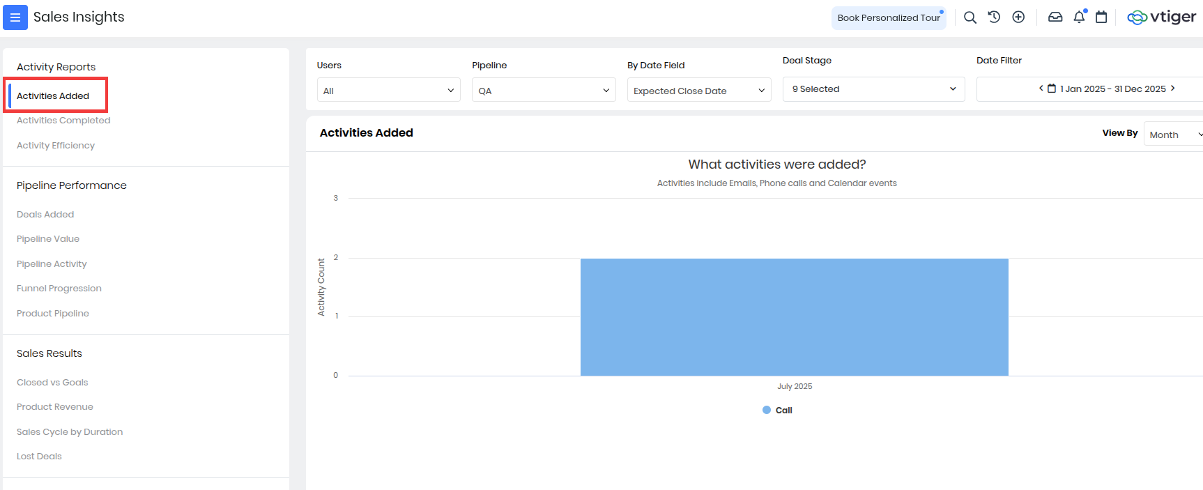
- This report displays all the activities added by your sales team in the form of a bar chart. This information helps you ensure that your sales team is on the right track to sealing a deal. You can filter chart data using the filters located above a report. Hovering on an Activity Type on the chart displays metrics such as activity count and effort (duration).
- Note: The chart for Activities Added only displays open activities or activities that are not marked as Held or Completed.
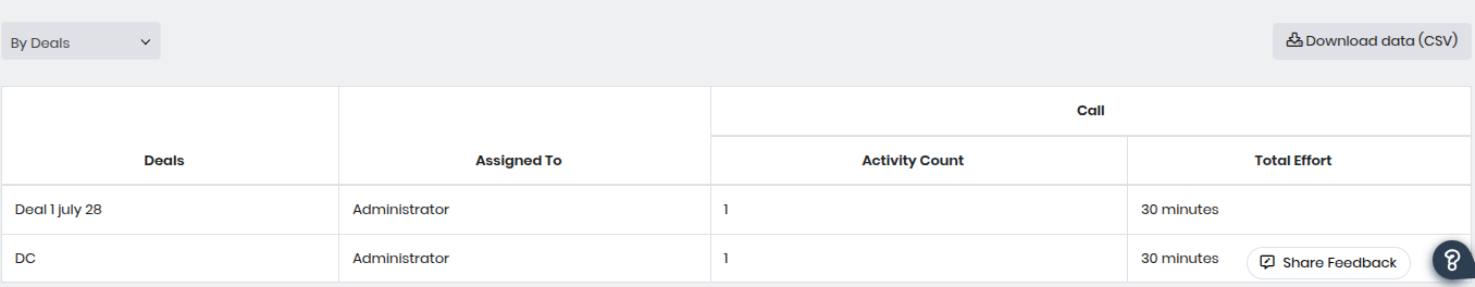
- The table above displays each deal's activity count and activity type. You can group the data in the table by Deal or Deal Owner using the drop-down displayed above the table.
- The table displays the following information:
- Deals: This column lists the specific deals that have had call activities recorded against them.
- Assigned To: This indicates the team member responsible for the deal and, by extension, for the recorded call activities.
- Activity Count: This number represents the total number of call activities logged for that specific deal.
- Total Effort: This crucial column quantifies the amount of time spent on call activities for each deal. It's measured in minutes.
- Example: A sales rep schedules 10 calls and 5 meetings with prospects during the week. The Activity Added report shows a total of 15 activities added by that rep for the selected period.
Activities Completed
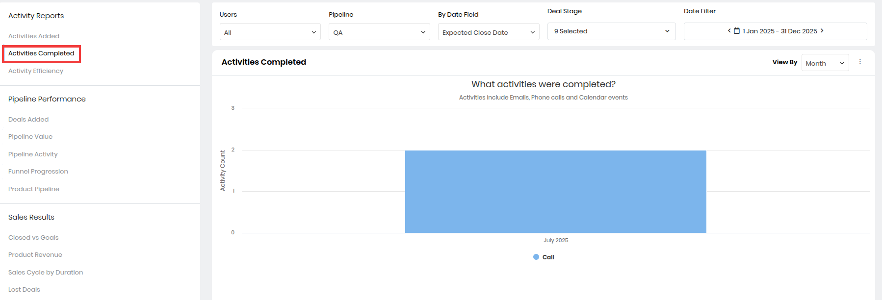
- You can view all the activities completed by your sales team by glancing at this chart. Hover on the chart to view activity metrics such as count and effort (duration).
- You can filter chart data for a particular activity type and hide data for other activities.
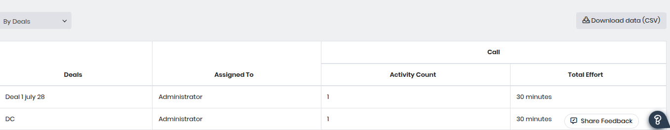
- The table below the chart shows the activity count for each deal, along with the type of activity. Group data in the table by Deal or Deal Owner using the drop-down located above the table.
- The table displays the following information:
- Deals: This column lists the specific deals that have had call activities recorded against them.
- Assigned To: This indicates the team member responsible for the deal and, by extension, for the recorded call activities.
- Activity Count: This number represents the total number of call activities logged for that specific deal.
- Total Effort: This crucial column quantifies the amount of time spent on call activities for each deal. It's measured in minutes.
- Example: Out of the 15 activities scheduled, the sales rep successfully completes 8 calls and 3 meetings. The Activity Completed report shows 11 completed activities for that timeframe.
Activity Efficiency
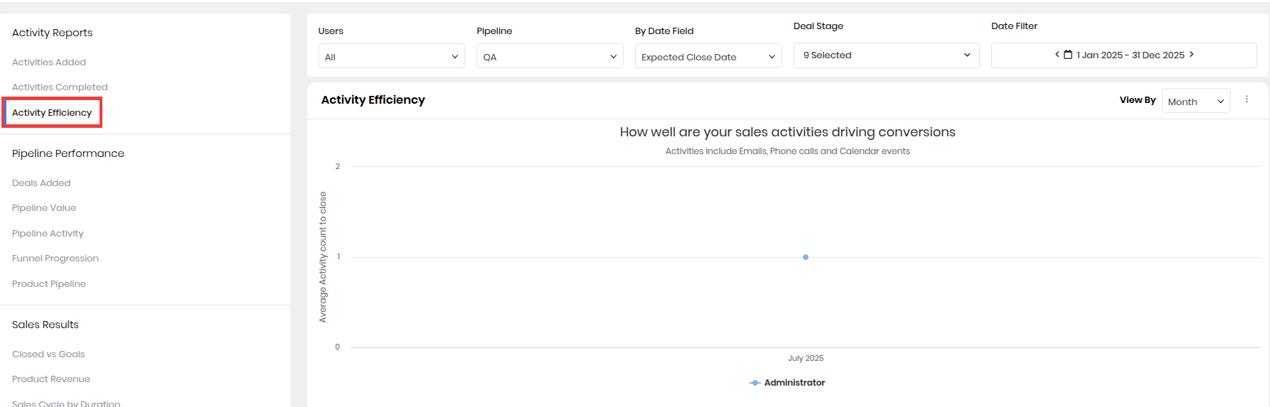
- Track your sales team’s efficiency with the help of this chart. It gives you insights into how effective a sales rep’s activities are towards winning a deal. The chart shows the average number of emails, phone calls, and calendar events performed by sales reps to win deals assigned to them. It also shows an estimate of the number of activities required by a sales rep to win a deal and the duration of each activity.
- The tabular form of the chart paints a clear picture of activity efficiency. Group the data in the table by Deal or Deal Owner using the drop-down displayed above the table.
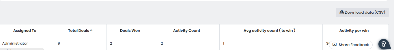
- The table displays the following information:
- Assigned To – The name of the sales representative responsible for the deals.
- Total Deals – Total number of deals handled by the representative within the selected time period.
- Deals Won – Number of deals successfully closed as “Won.”
- Activity Count – Total count of sales activities (calls, emails, meetings) performed.
- Avg Activity Count (to win) – Average number of activities needed to close a single won deal.
- Activity per Win (%) – Efficiency percentage showing the ratio of total activities to deals won, indicating productivity.
- Example: The sales rep added 15 activities and completed 11 of them. The Activity Efficiency report calculates this as (11 completed ÷ 15 added) × 100 = 73% efficiency, helping managers track follow-through on scheduled tasks.
Pipeline Performance
The charts under Pipeline Performance provide you with a visual representation of your sales pipeline:
- Status and value of your pipeline
- Progression of deals in the pipeline
- Sales reps’ activities on open deals
Here are the charts available in Pipeline Performance:
Deals Added
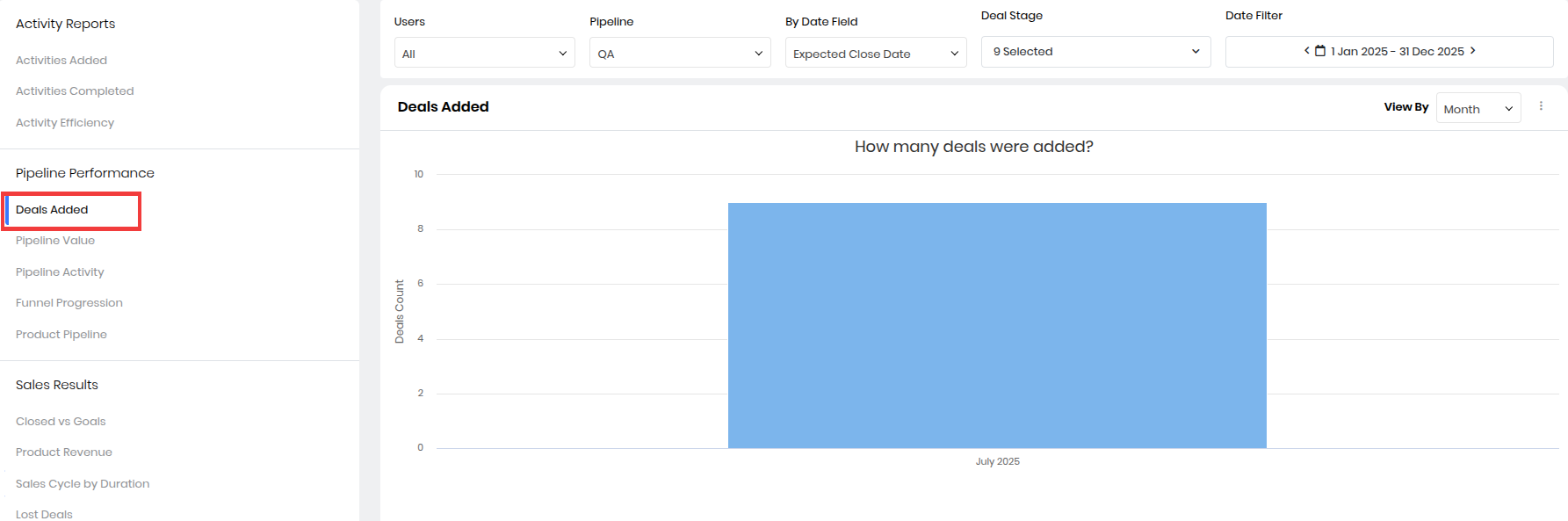
- The chart shows the number of deals added to your pipeline.
- Hovering on the chart gives the count of deals added.
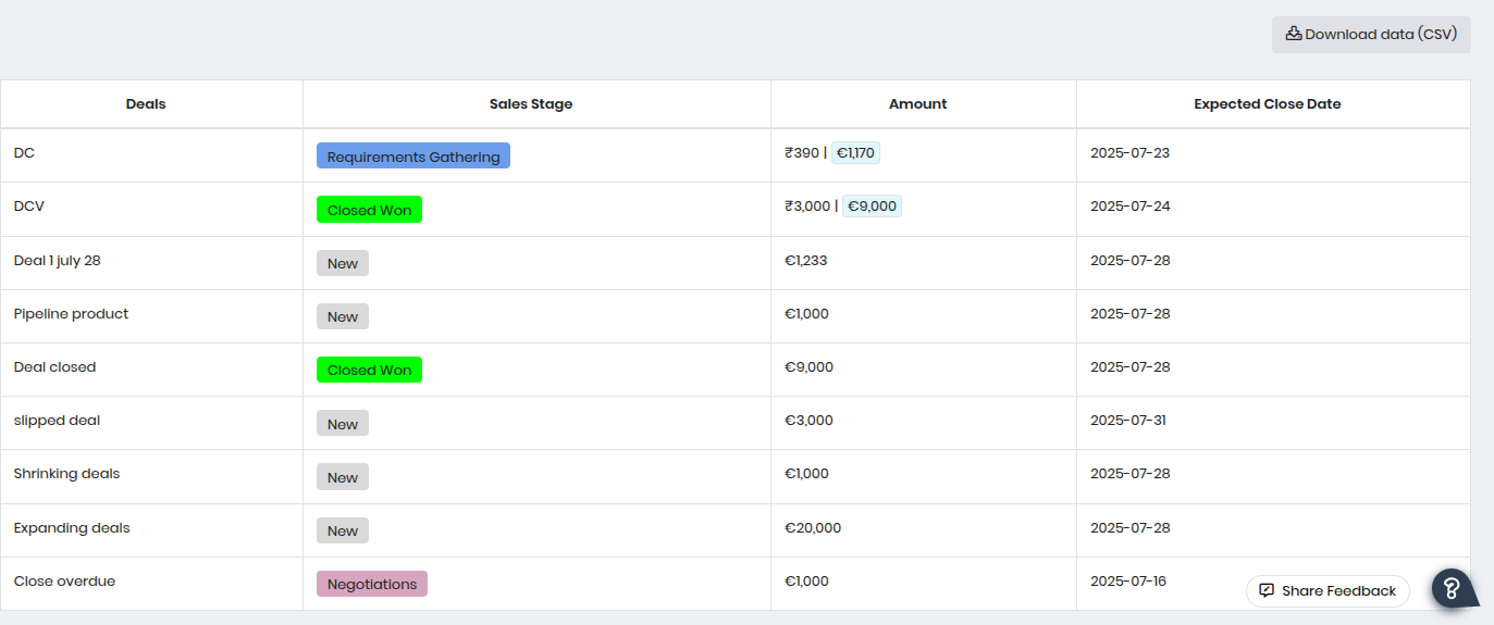
- The above image displays the deal details in a tabular format. These tabular formats are visible below the chart. The table displays the following information:
- Deals – Displays the name or title of each deal added to the pipeline.
- Sales Stage – Indicates the current progress of the deal.
- Amount – Shows the monetary value of the deal, including amounts in different currencies if applicable.
- Expected Close Date – The projected date on which the deal is expected to close, helping track timelines for forecasting.
- Example: In a given month, a sales rep creates 20 new deals in the system worth a combined $80,000. The Deals Added report shows the number and value of new opportunities added to the pipeline during that month.
Pipeline Value
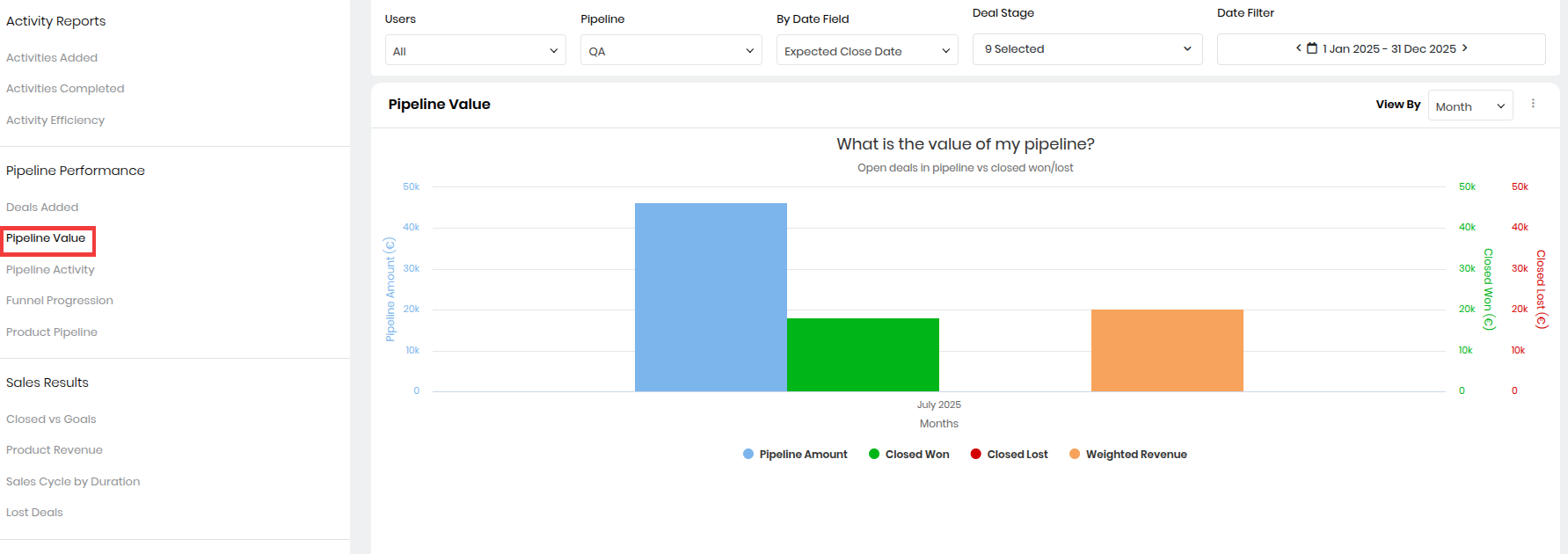
- Get a comparison of open and closed deals with the help of this chart. Hovering on the chart displays the following:
- The total value of deals that were ‘Closed Won’
- Total value of deals that were ‘Closed Lost’
- Value of deals currently in the pipeline
- Total weighted revenue of deals
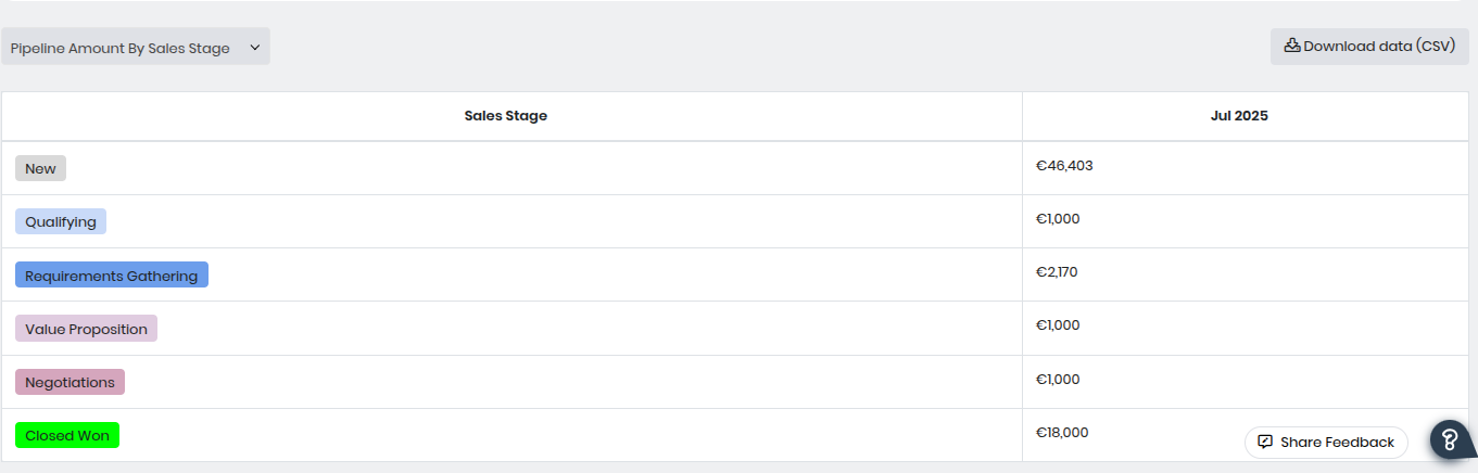
- The green bar represents Closed Won deals, and the red bar represents Closed Lost deals. The blue bar represents open deals. You can view the list of open deals in the table, along with deals won and lost. The deals are sorted by Pipeline Amount by Sales Stage.
- The table displays the following information:
- Sales Stage – Lists the different stages of the sales process (e.g., New, Qualifying, Requirements Gathering, Value Proposition, Negotiations, Closed Won).
- Amount (by Month) – Displays the total deal value for each stage within the selected month (here, July 2025). This indicates how much potential revenue is currently in each stage.
- Example: The team currently has 50 active deals in the pipeline worth $250,000 in total. The Pipeline Value report displays this total value, helping the team assess potential revenue for upcoming periods.
Pipeline Activity
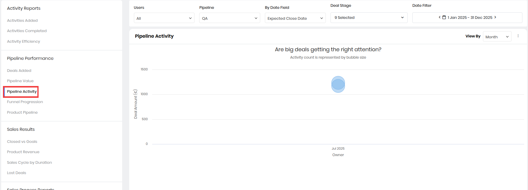
The chart tracks sales reps’ activities on the biggest deals or deals with the highest amount. By hovering over the chart, you can view the following:
- Deal name
- Deal amount
- The current Sales Stage of the deal
- Activity count of the sales rep on the deal
- Expected close date of the deal
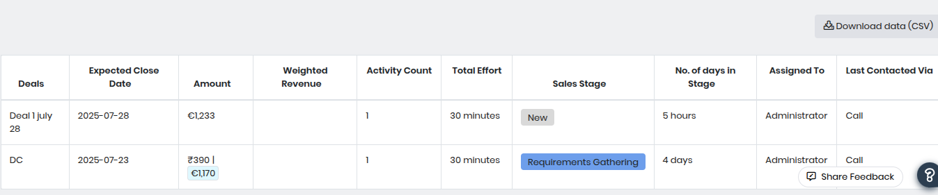
- You can view pipeline activity in a tabular format below the graphical representation. The table lists deals in decreasing order of deal amount and the total effort spent on each deal. This data helps you determine sales reps’ performance.
- Deals – Displays the name of each deal currently in the pipeline.
- Expected Close Date – Indicates the projected date when the deal is expected to be closed.
- Amount – Shows the total deal value. If multiple currencies are used, amounts may be shown in both currencies.
- Weighted Revenue – The revenue is adjusted for the probability of winning the deal, providing a more realistic forecast.
- Activity Count – Number of activities (calls, meetings, etc.) logged against the deal.
- Total Effort – The cumulative time spent on activities related to this deal.
- Sales Stage – Reflects the current stage of the deal (e.g., New, Requirements Gathering).
- No. of Days in Stage – Indicates how long the deal has remained in its current stage.
- Assigned To – The sales representative or user responsible for managing the deal.
- Last Contacted Via – Shows the mode of the most recent activity (e.g., call, email).
- Example: During the last quarter, 120 activities (calls, meetings, follow-ups) were logged against pipeline deals. The Pipeline Activity report shows this activity count, helping managers track engagement with open deals.
- Note: The bubble size represents the activity count. The bigger the bubble, the higher the activity count. Also, the color of a bubble is red if a deal is idle or there is no activity on it for a specified period. As an admin user, you can set up idle alerts on deals by going to Actions.
Funnel Progression
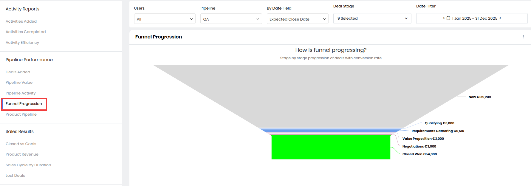
The Funnel Progression chart depicts the progress of deals from one sales stage to another. Hovering on a sales stage in the funnel displays the following:
- Name of the sales stage
- Value (amount) of deals present in the sales stage
- Number of deals present in the sales stage
- Number of deals that progressed to the next sales stage in the pipeline
- Percentage of deals that progressed to the next sales stage in the pipeline
- With this data, you understand how your deals progress from one sales stage to another. You can identify the points in your sales funnel where you are losing deals and improve your sales process for better and quicker deal closure.
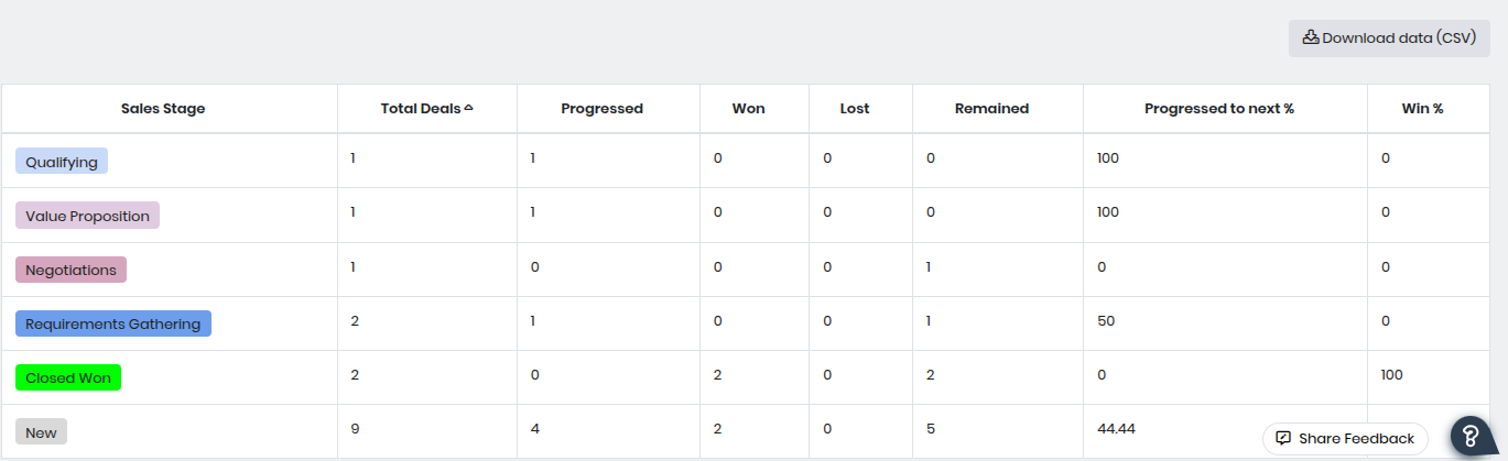
- In the tabular format, you can view the percentage of deals progressing from one stage to another, along with the win percentage.
- Sales Stage – Lists each stage in the sales process (e.g., New, Qualifying, Value Proposition, Negotiations, Closed Won).
- Total Deals – The number of deals currently present in each sales stage.
- Progressed – The count of deals that have advanced from this stage to the next stage in the funnel.
- Won – The number of deals in this stage that were successfully closed as Won.
- Lost – The number of deals in this stage that were closed as Lost.
- Remained – Deals that are still in the same stage and have not yet progressed or closed.
- Progressed to Next % – Percentage of deals that successfully moved from this stage to the next one in the funnel.
- Win % – Percentage of deals in this stage that were successfully closed as Won, providing insights into stage-specific conversion effectiveness.
- Example: The sales funnel table indicates bottlenecks in the Qualifying and Value Proposition stages, with 0% progression, and a significant number of New deals being lost.
Product Pipeline
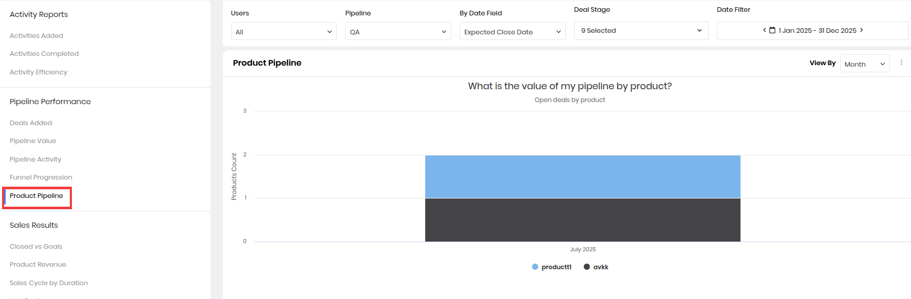
The Product Pipeline chart displays all open deals, their associated products, and their value. This chart helps you identify highly in-demand products and those that are likely to be sold. Hovering on the chart gives the count and value of the products in the pipeline.
- You can also sort the chart by month, quarter, year, or user. The data is also displayed in tabular format right below the chart.
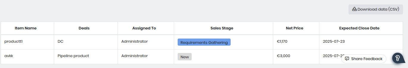
- The table displays the following information:
- Item Name – Displays the product name associated with the deal.
- Deals – Shows the name or identifier of the deal linked to the product.
- Assigned To – Indicates the user or team member responsible for handling the deal.
- Sales Stage – Reflects the current stage of the deal. This helps track the product’s progress in the sales cycle.
- Net Price – Displays the deal value associated with that product, useful for revenue estimation.
- Expected Close Date – Indicates the anticipated date when the deal is expected to be closed, helping forecast future sales timelines
- Example: The product pipeline shows productt1 for deal DC is in Requirements Gathering with a net price of €1,770 and expected close date of July 28, 2025, while avkk is a New pipeline product with a net price of €3,000 and an expected close date of July 27, 2025.
Sales Results
Under Sales Results, you can view the following charts:
- Closed vs. Goals
- Product Revenue
- Sales Cycle by Duration
- Lost Deals
Here is what each chart displays.
Closed vs. Goals
How many deals have you closed against the sales quota defined for you? This information is available in the Closed vs. Goals chart. The sales quotas are defined from the forecast and quota values established for your team.
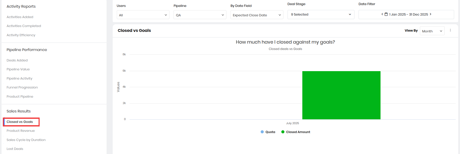
- The blue bar is the goal assigned to you, and the green bar is the deals you have closed. Hovering on the chart displays the following:
- Value of deals closed by a sales rep
- Sales quota set for a sales rep
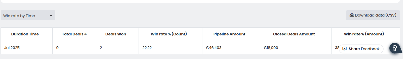
- The table below the chart presents Closed vs. Goals data along with the win rate per month. You can group the table data in the following ways using the drop-down:
- Win Rate by Time
- Closed Deals by Time
- Win Rate by Owner
- The table displays the following information
- Duration Time – Indicates the time period for the data shown (e.g., monthly, quarterly).
- Total Deals – The total number of deals recorded in that period, regardless of whether they were won or lost.
- Deals Won – Shows the number of deals successfully closed as Won.
- Win Rate % (Count) – The percentage of deals won compared to the total number of deals for that time period.
- Pipeline Amount – Total potential deal value in the pipeline during the given period.
- Closed Deals Amount – The actual revenue achieved from closed-won deals during that period.
- Win Rate % (Amount) – The percentage of closed revenue compared to the total pipeline value, providing insight into the monetary success rate.
- Note: As a sales manager, you can see your sales team’s data in the Closed vs. Goals chart.
- Example: A sales rep has a monthly goal of closing deals worth $50,000. By mid-month, they have closed deals totaling $30,000. The Closed vs. Goals report shows 60% progress toward their goal, helping track performance against targets.
Product Revenue
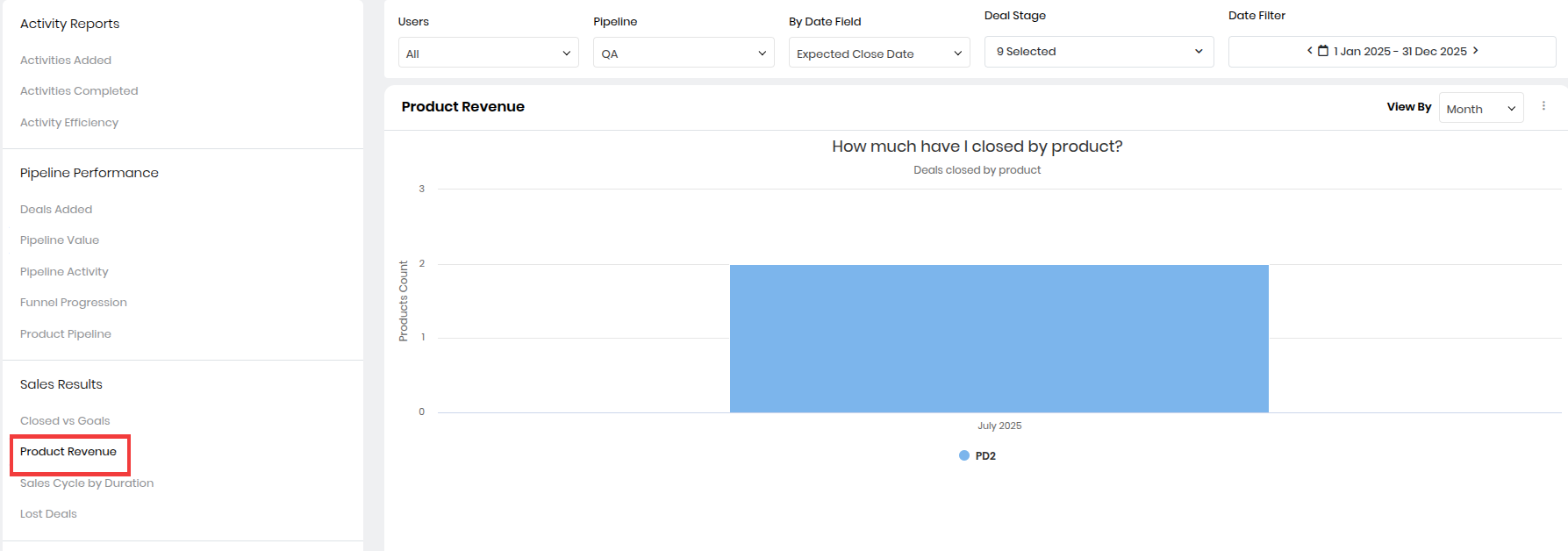
Get a breakdown of your sales by the number of products sold and their value. The chart helps you identify the most sold products and makes the process of sales forecasting easy. Hovering on the chart gives the count and value of products sold.
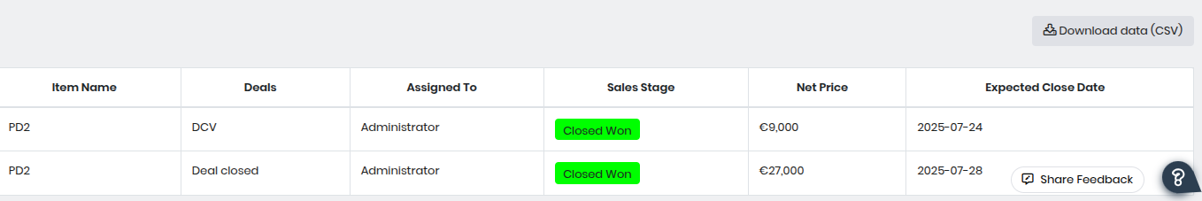
- You can view the data in the tabular format displayed below the chart. The table displays the following information:
- Item Name – Displays the name of the product associated with the deal.
- Deals – Shows the specific deal name in which the product was sold.
- Assigned To – Indicates the user or sales representative responsible for the deal.
- Sales Stage – Shows the current stage of the deal (e.g., Closed Won for successfully closed deals).
- Net Price – Displays the revenue generated from that product in the deal.
- Expected Close Date – Indicates the date when the deal was expected to be closed, useful for tracking sales timelines.
- Example: In a quarter, Product A generates $40,000 in sales and Product B generates $25,000. The Product Revenue report highlights which products contribute the most revenue, helping focus on best-sellers.
Sales Cycle by Duration
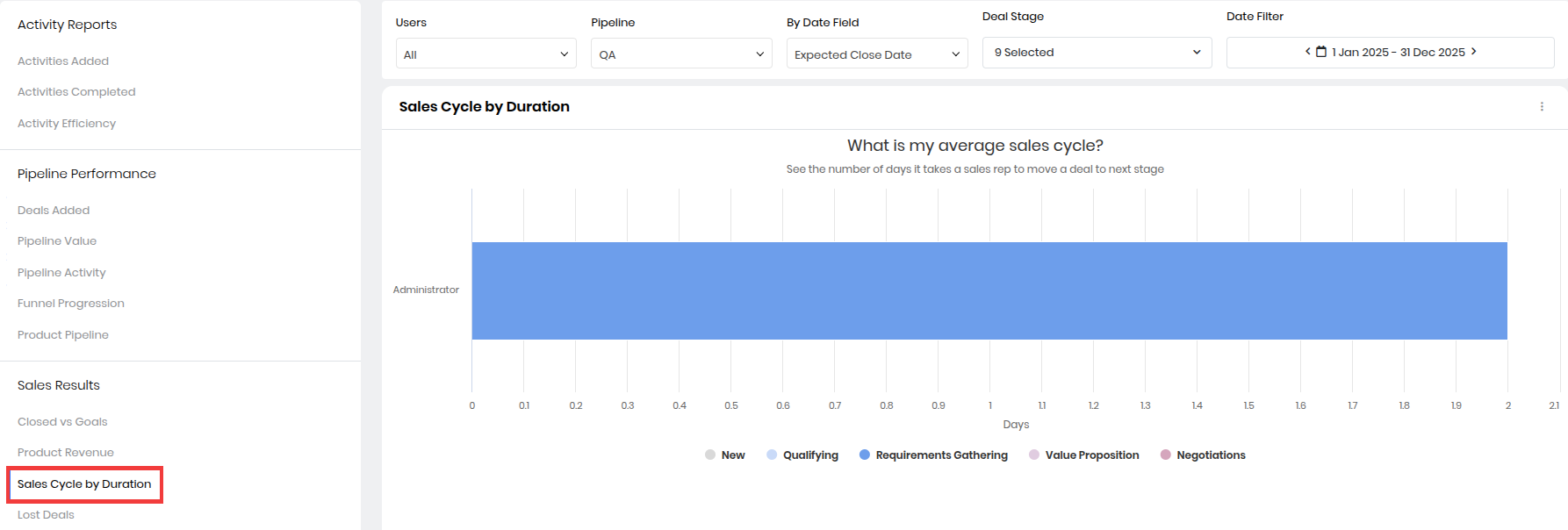
How much time does a sales rep take to move a deal from one sales stage to another? What is the average age of deals a sales rep is handling? Sales Cycle by Duration answers these questions for you. The data is sorted by sales stage. Hovering on the chart displays the total number of days deals remained in the sales stage.
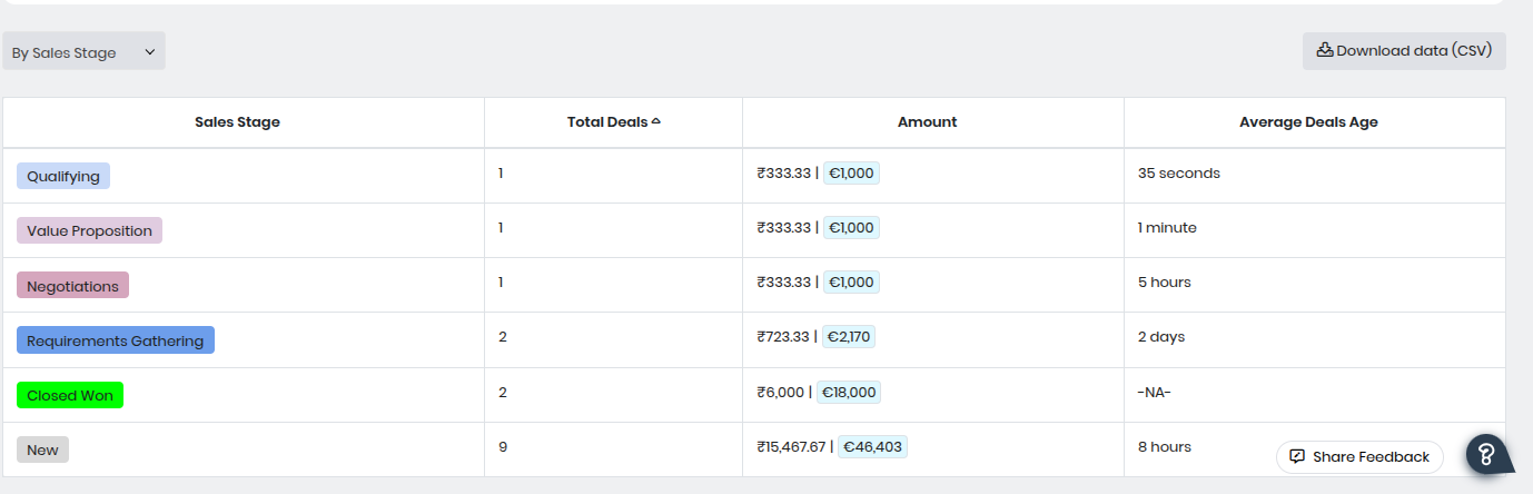
- You can view the average sales cycle in a tabular format below the chart. Group data in the table by Sales Stage or Deal Owner using the drop-down displayed above the table.
- This table allows sales teams to analyze how quickly deals move through the pipeline, evaluate the value at each stage, and identify where deals are spending the most time. It can help optimize the sales cycle and improve closure rates.
- Sales Stage – Lists each stage in the sales pipeline (e.g., New, Qualifying, Requirements Gathering, Value Proposition, Negotiations, Closed Won).
- Total Deals – Shows the count of deals currently in each stage. This helps identify which stages have the most activity.
- Amount – Displays the total monetary value of deals in each stage. The table may show amounts in multiple currencies if configured.
- Average Deals Age – Indicates the average time deals have been in that particular stage (displayed in seconds, minutes, hours, or days). This helps identify bottlenecks in the sales process.
- Example: Deals closed by the sales team take an average of 35 days from creation to closure. The Sales Cycle by Duration report reveals this average, helping identify if sales processes can be shortened.
Lost Deals
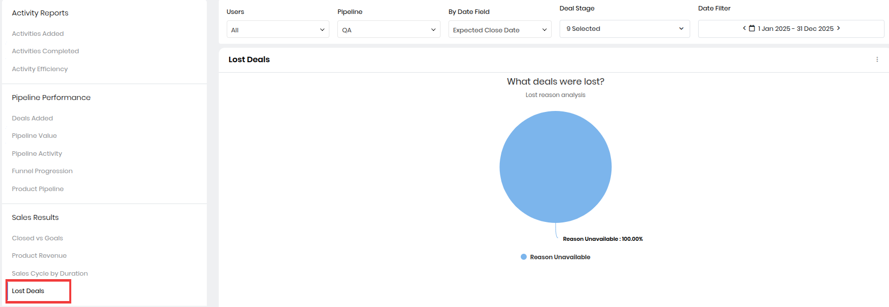
Track the reasons for deals lost by looking at this chart. It gives you the percentage of deals lost and the reasons for losing the deals.
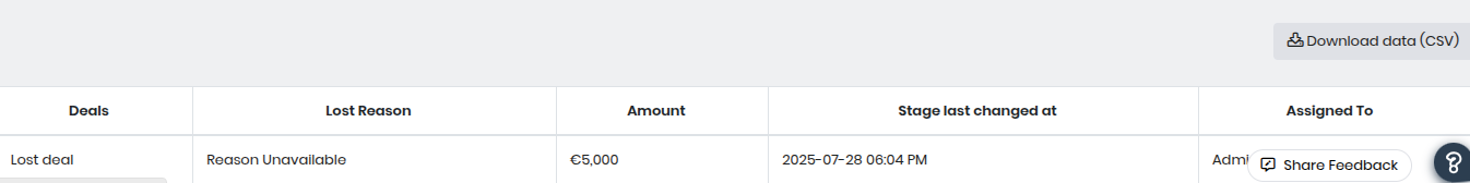
- The above table provides a breakdown of deals that were marked as lost, along with key information to help analyze why the deal was not closed successfully:
- Deals – Displays the name or identifier of the deal that has been lost.
- Lost Reason – Shows the reason recorded for losing the deal (e.g., Reason Unavailable if no reason was provided).
- Amount – Indicates the deal value that was lost, helping teams assess revenue impact.
- Stage Last Changed At – Shows the exact date and time when the deal stage was updated to Lost, enabling timeline tracking.
- Assigned To – Displays the user or team member responsible for the deal when it was lost, useful for performance reviews and follow-ups.
Sales Process Reports
Sales Process Reports are displayed only when you have other users reporting to you. Sales Process Reports give you the following charts and related information:
Idle Deals
The chart gives the number of idle deals. A deal is said to be idle if there has been no interaction on it for a specified period. Hovering on the chart gives you the count of idle deals. The list of all idle deals is displayed in a tabular format below the chart.
Example: A sales rep created a deal worth $10,000 on June 1, but no activity (call, email, or update) has been logged for 15 days. The Idle Deals report highlights this deal so the manager can prompt follow-up.
Note: As an Admin user, you can set up idle alerts for Deals and Organizations by going to Main Menu > Essentials > Actions.
Idle Orgs
The chart gives the number of idle organizations. An organization is said to be idle if there has been no interaction with it for a specified period. Hovering on the chart gives the count of idle organizations.
Example: An organization record was last contacted 30 days ago, even though it has multiple active opportunities. The Idle Organizations report alerts managers to re-engage with such accounts to prevent losing potential sales. The list of all idle organizations is displayed in a tabular format below the chart.
Slipped Deals
How many deals missed their Expected Close Date? For how many deals was the close date revised? With this data, you gain insights into the performance of your sales team and the status of your sales pipeline. Hovering on the chart gives the count of slipped deals.
Example: A deal was expected to close on July 15 but was moved to August 1 without being closed. The Slipped Deals report shows these postponed opportunities, helping managers investigate reasons for the delay and adjust forecasts. The table below the chart gives you details about the deals that missed the Expected Close Date.
Overdue Deals
The chart shows deals that have passed their Expected Close Date and have not been closed. This information comes in handy when you gauge your sales team's performance. Hovering on the chart gives the count of overdue deals.
Example: A deal’s expected close date was July 10, but today is July 20, and the deal is still open. The Overdue Deals report lists such deals so sales managers can follow up and ensure timely closure or update of records. The list of overdue deals is displayed right below the chart.
Deal Journeys
To compare the number of journey tasks in your pipeline and the actual number of journey tasks completed, you can view the Deal Journeys chart. The chart depicts the progress of sales teams in task completion. Hovering on the chart gives the count of deals and the task progression percentage for those deals.
Example: A deal moves from Qualification to Proposal and finally Closed Won in 25 days. The Deal Journeys report provides a timeline of each stage transition, allowing managers to analyze sales cycle patterns and identify bottlenecks. You can view the chart data in a tabular format below the chart.
Using Filters
You can filter Sales Insights data using the available fields to narrow down the information you want to view. For example, you can filter data based on a specific period, pipeline, or sales stage. The Global Filters option also lets you refine charts by month, quarter, or year for easier analysis. Additionally, if you manage a team, you can apply user filters to view data for individual team members reporting to you.
Example: Consider this example of the Lost Deals section in Sales Insights.
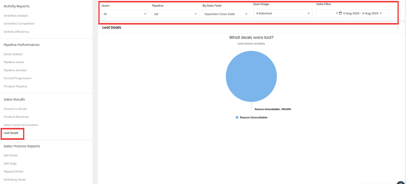
This screenshot highlights how you can analyze lost opportunities and identify the reasons behind them. Listed below are the filters you can use to display related data.
- Users: All
- This filter lets you view sales insights for specific users or the entire team.
- You can select individual sales reps to view their specific performance
- Pipeline: QA
- Pipelines represent different sales processes in your business (e.g., B2B sales, Renewals, etc.).
- In this case, the QA pipeline is selected, which could refer to a specific sales flow.
- This helps analyze lost deals specific to that pipeline, excluding others.
- By Date Field: Expected Close Date
- This filter defines which date field is used for the report.
- Expected Close Date refers to the deals expected to close within the chosen date range.
- Other date fields, like Created Date or Modified Date, can also be selected depending on the analysis.
- Deal Stage: 9 stages selected
- This filter allows you to choose one or more deal stages to focus your report on.
- The 9 selected stages might include various points like Prospecting, Proposal Sent, Negotiation, etc.
- Only deals that fall under these selected stages are shown in the report.
- Date Filter: 6 Aug 2025 – 6 Aug 2025
- This limits the data to a specific time range.
- In this example, only deals expected to close on 6th August 2025 are included.
- You can adjust this to a range (week, month, quarter, year) depending on the reporting needs.
These settings affect the Lost Deals report displayed below the filters, showing that 100% of lost deals were due to an unavailable reason within the specified filter criteria.
Actions Possible on Charts
Customizing data views
- On charts
- You can group data shown on a chart by month, quarter, year, or user. To do this, use the drop-down displayed on the top right of the chart.
- As a sales rep, you can only group data by month, quarter, or year.
- In tables
- You can group the table data in the following ways using the drop-down:
- Win Rate by Time
- Closed Deals by Time
- Win Rate by Owner
- You can sort data by Deal or by Deal Owner by choosing the appropriate option from the drop-down displayed below the chart. This filter is not available on all charts.
- You can group the table data in the following ways using the drop-down:
Other actions
Clicking on the Ellipsis (three dots) on a chart gives you three options:
- Full Screen - To view the chart in full screen
- Print - To get a print-out of the chart
- Save as Image -To save or download the chart as an image in PNG format on the local system
Reference
- Deal Management Overview
- Managing your Deals
- One View in Deals
- Deal Stages and Lifecycle
- The Deal Room
- Deal Health - A Calculus Feature
- Managing your Sales Pipeline